Design

Responsive websites

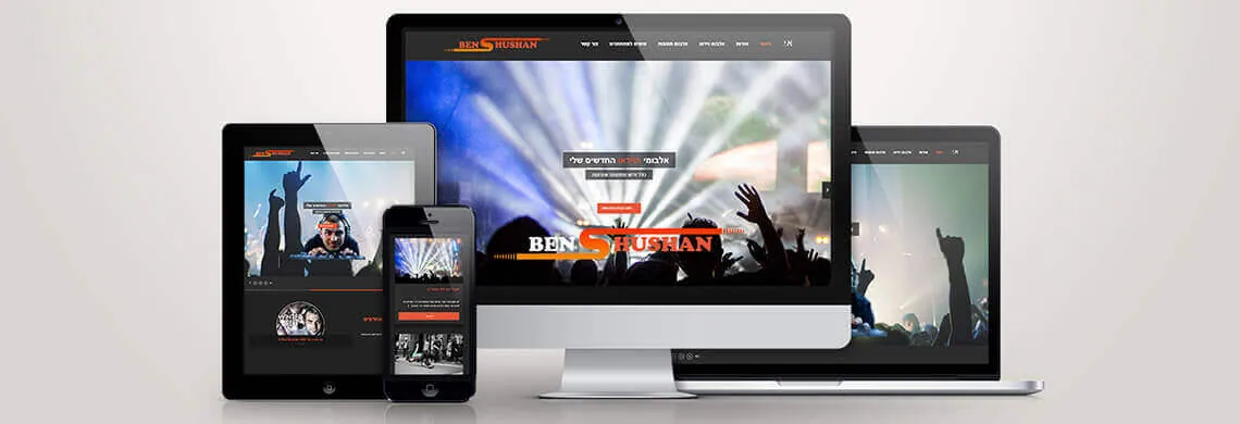
Article illustration: Responsive websites

What are they?

A responsive website adapts itself to the device it is viewed on. Today people browse on devices of every size, so responsive sites are far more convenient for everyone using phones, tablets and other devices. This is done with CSS3, which lets the browser detect the device the visitor is using and adjust the layout and resolution in the most proportional, optimal way for that device. The big advantage of responsive websites is the browsing experience: the design makes navigation easier and every action more comfortable.
Contact us today and we will make sure your website works beautifully on every device.

The author:

Marat Rempel, WordPress developer.

CEO and owner of LM Web Solutions

Let's talk

Have a project? We'd love
to hear about it.

A new website, complex development, ongoing maintenance or an idea you're not sure how to bring to life yet. Tell us what you need and we'll work out the right solution together. No unnecessary sales pitches, just a straightforward professional conversation.

    What would you like to talk about?

    You are not legally required to provide your details, but without them we can't get back to you. We will use your details only to contact you and handle your inquiry, and for marketing emails only if you opted in separately. Your details are stored by LM Web Solutions [and in our CRM system] and will never be sold. You have the right to access your information and to request its correction or deletion by writing to marat@lm-studio.co.il. Privacy policy